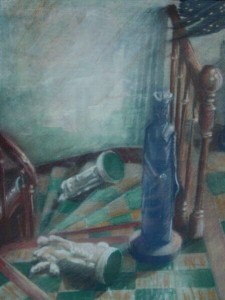
Time: 12 hours Paper: Strathmore illustration board, 40 x 30″ Media: Rostow and Jung Akua Kolor slow drying black ink and white acrylic Actuals: my studio:


Process: Unreal amount of time going up and down ladders balancing a big piece of board and Rotring Art Pen loaded with gray ink for initial layout. After researching noir comics, I decided to melodramatize perspective, adding a stair, changing floor tile size, increasing proportional ratios which led to a rather a messy layout as I use only permanent drawing media, no pencils, for reasons too lengthy and vitriolic on my part to go into here.

At this point, according to How To Draw Noir Comics by Shawn Martinbrough, the image is to be Xeroxed several times for working out where to put the black before inking the actual. This would probably work on a smaller drawing but reducing my 40 x 30″ to even an 11 x 14″ digital print turned the lines to mush. So I just dove in with a light gray ink wash until it looked all right. So much for process. I’d say about half my initial lines, about half the effort I put into it ended up under several coats of black ink or several coats of white acrylic: seven wolves were reduced to two, I had a really cool floor tile reflection going on in the window that had to go, the bird in flight looked like it was hanging from a light fixture, not flying around it, so one of my light fixtures also bit the dust. On and on. Most disconcerting was that even at 40 x 30, even in a glorified negative space drawing, one false step with the brush and motorcycle helmets became a pile of rags, ravens turned into sparrows (oh well, ravens are so overused anyway) or wolves in the snow became floundering Dachshunds. I never did get past gray scaling to black and white in the purist sense either: see detail below. Nevertheless it was a rather special week seeing everything as a Noir Comic and realizing the enormous potential of this assignment in effective linear perspective.