2009.11.30

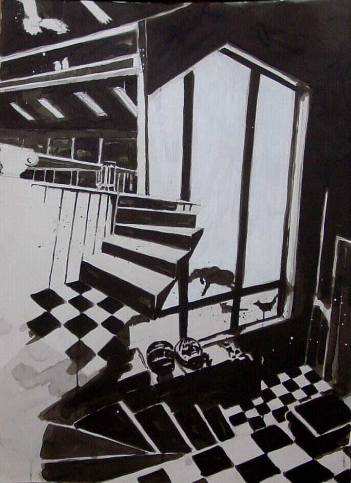
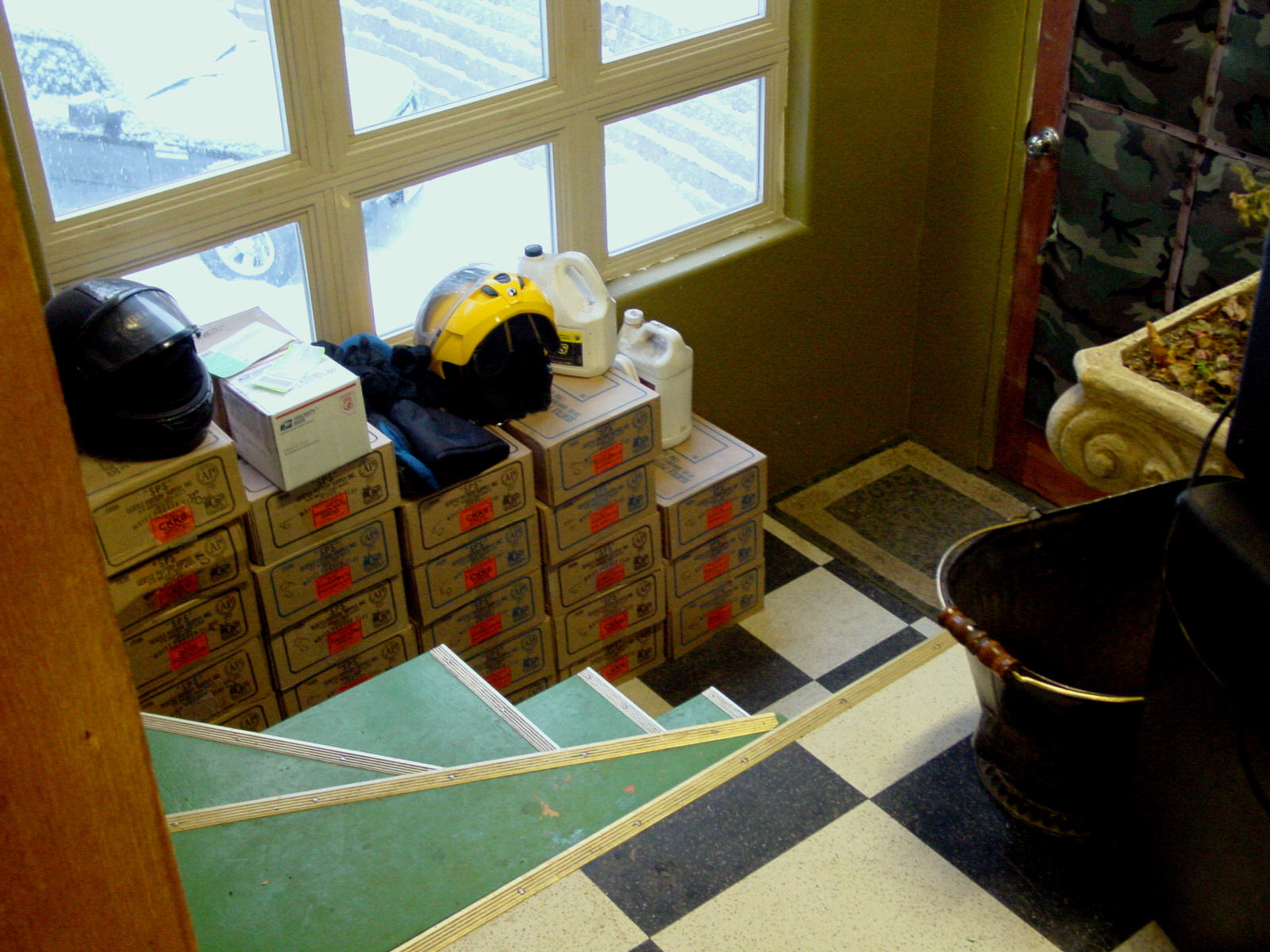
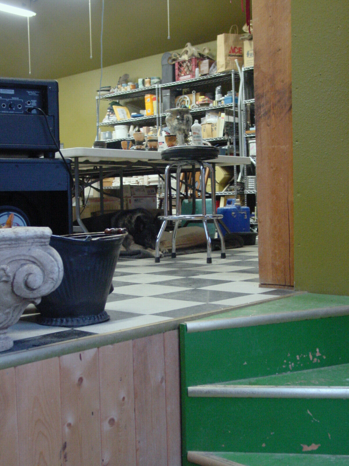
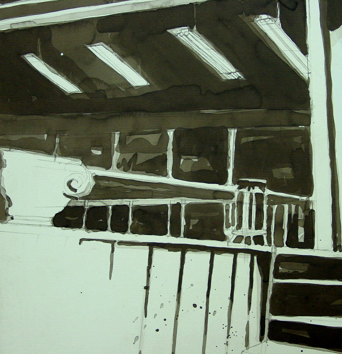
Time: 12 hours Paper: Strathmore illustration board, 40 x 30″ Media: Rostow and Jung Akua Kolor slow drying black ink and white acrylic Actuals: my studio:


Process: Unreal amount of time going up and down ladders balancing a big piece of board and Rotring Art Pen loaded with gray ink for initial layout. After researching noir comics, I decided to melodramatize perspective, adding a stair, changing floor tile size, increasing proportional ratios which led to a rather a messy layout as I use only permanent drawing media, no pencils, for reasons too lengthy and vitriolic on my part to go into here.

At this point, according to How To Draw Noir Comics by Shawn Martinbrough, the image is to be Xeroxed several times for working out where to put the black before inking the actual. This would probably work on a smaller drawing but reducing my 40 x 30″ to even an 11 x 14″ digital print turned the lines to mush. So I just dove in with a light gray ink wash until it looked all right. So much for process. I’d say about half my initial lines, about half the effort I put into it ended up under several coats of black ink or several coats of white acrylic: seven wolves were reduced to two, I had a really cool floor tile reflection going on in the window that had to go, the bird in flight looked like it was hanging from a light fixture, not flying around it, so one of my light fixtures also bit the dust. On and on. Most disconcerting was that even at 40 x 30, even in a glorified negative space drawing, one false step with the brush and motorcycle helmets became a pile of rags, ravens turned into sparrows (oh well, ravens are so overused anyway) or wolves in the snow became floundering Dachshunds. I never did get past gray scaling to black and white in the purist sense either: see detail below. Nevertheless it was a rather special week seeing everything as a Noir Comic and realizing the enormous potential of this assignment in effective linear perspective.

2009.11.30
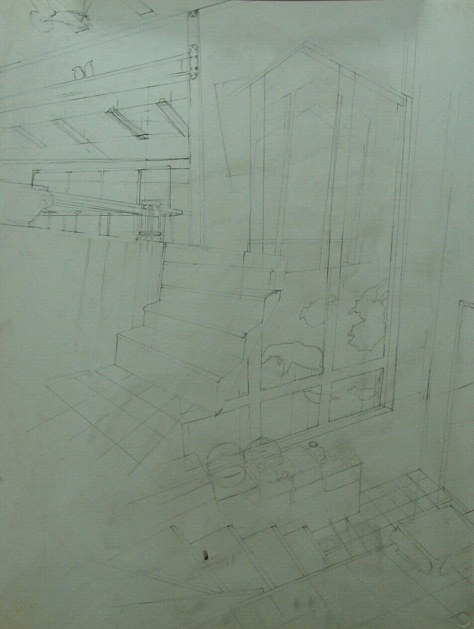
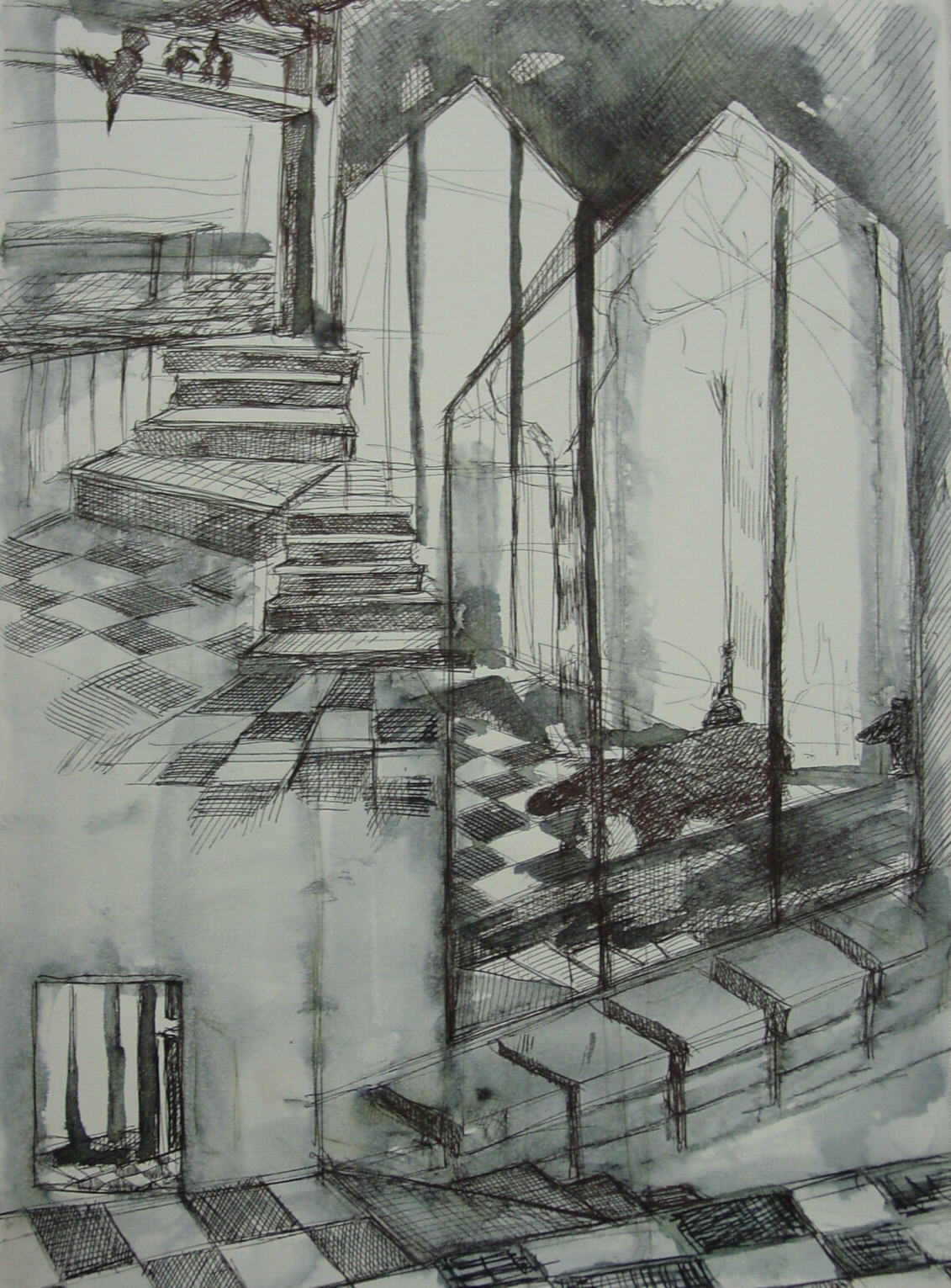
I was inspired by the dramatic linear perspective effects of Noir Comics. Decided to try out some of the methods using the marvelous and challenging angles of my studio. Preliminary sketch:

2009.11.30
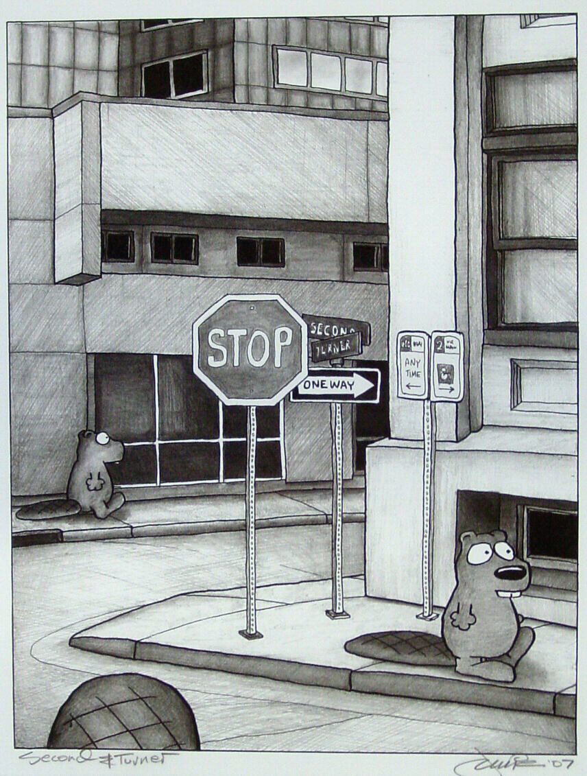
This assignment was inspired by a drawing by Jamie Smith, a copy of which currently graces my home. It led me to reevaluate the use of linear perspective in terms of cartoons and comics. Hours of research has led me to believe that there are few art genres beyond cartoonists and comic artists who understand the magic, effectiveness and drama of linear perspective.

Websites: Jamie Smith’s blog: http://inksnow.blogspot.com/ and one of my long time favorite mangas by Tsutomu Nihei http://www.onemanga.com/BLAME/
Descriptive Words Cartoon/Comics: narrative, mass publication format, sequential,word balloons, panels, graphic design, stylistic, iconography, layout, illustration
2009.11.23

What is this? What I am seeing? What does it mean? Ooooh. For more information, see the Week 3 Sketchbook entry on this blog.
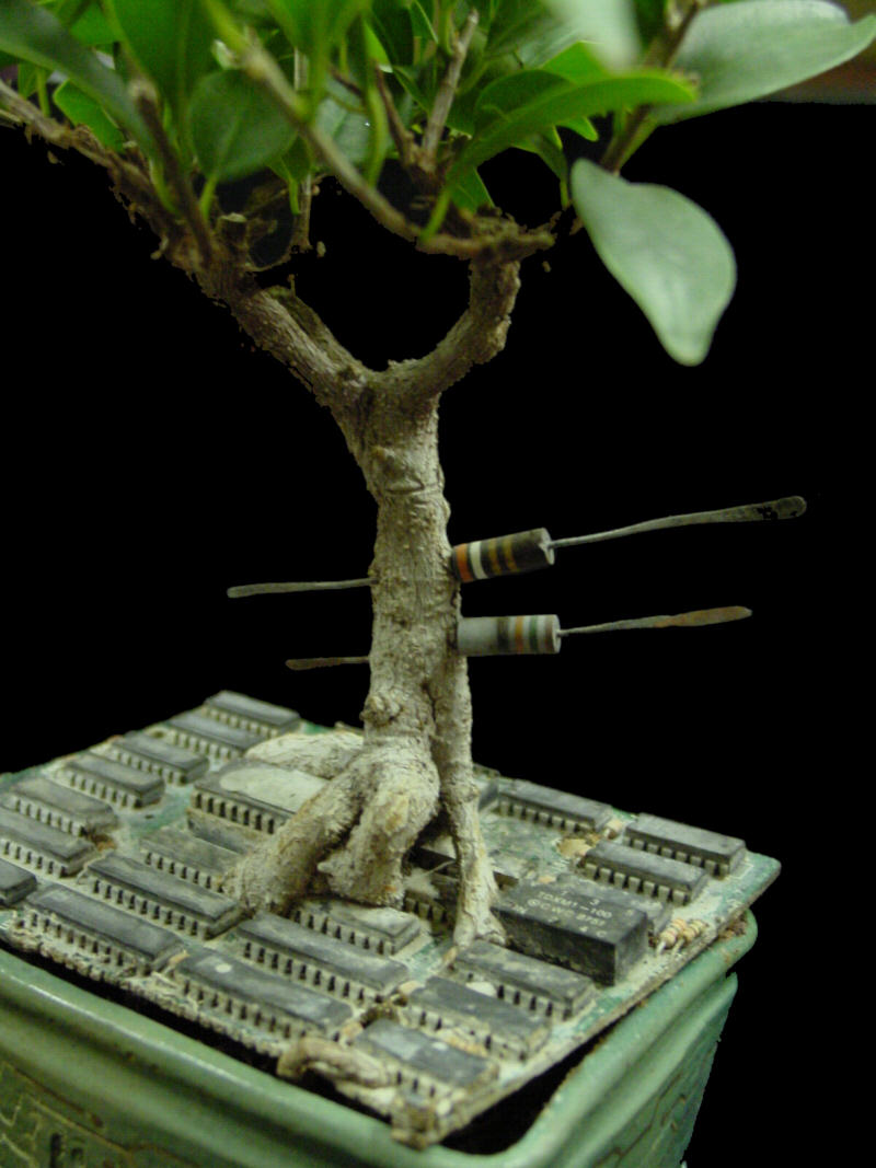
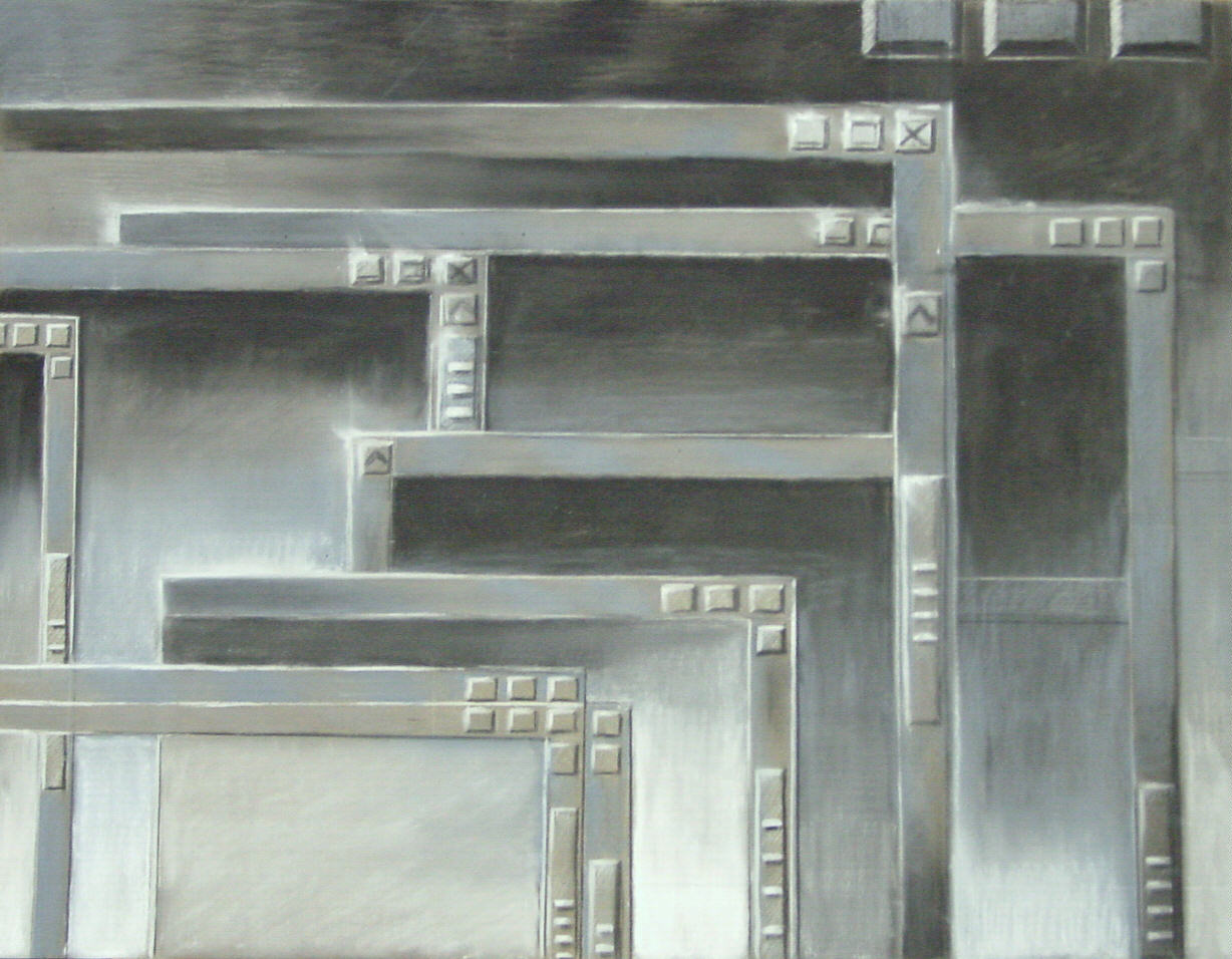
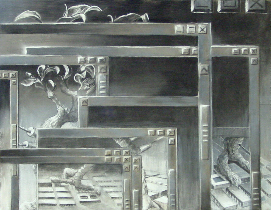
Time: 6 hours. Paper: Sennelier pastel card. 19 x 26″. Media: Black, white and gray pastel. Actuals: a standard laptop run amok on MS Vista and a bonsai root trained on a circuit board:

Process: I love drawing on pastel card, basically like drawing on sand paper. It allows for many clean layers of pastel. If only it came in 54″ x 10 yard rolls. First layer:

Second layer. Drawing from bonsai, overemphasizing the circuit board and linear perspective because I liked it that way:

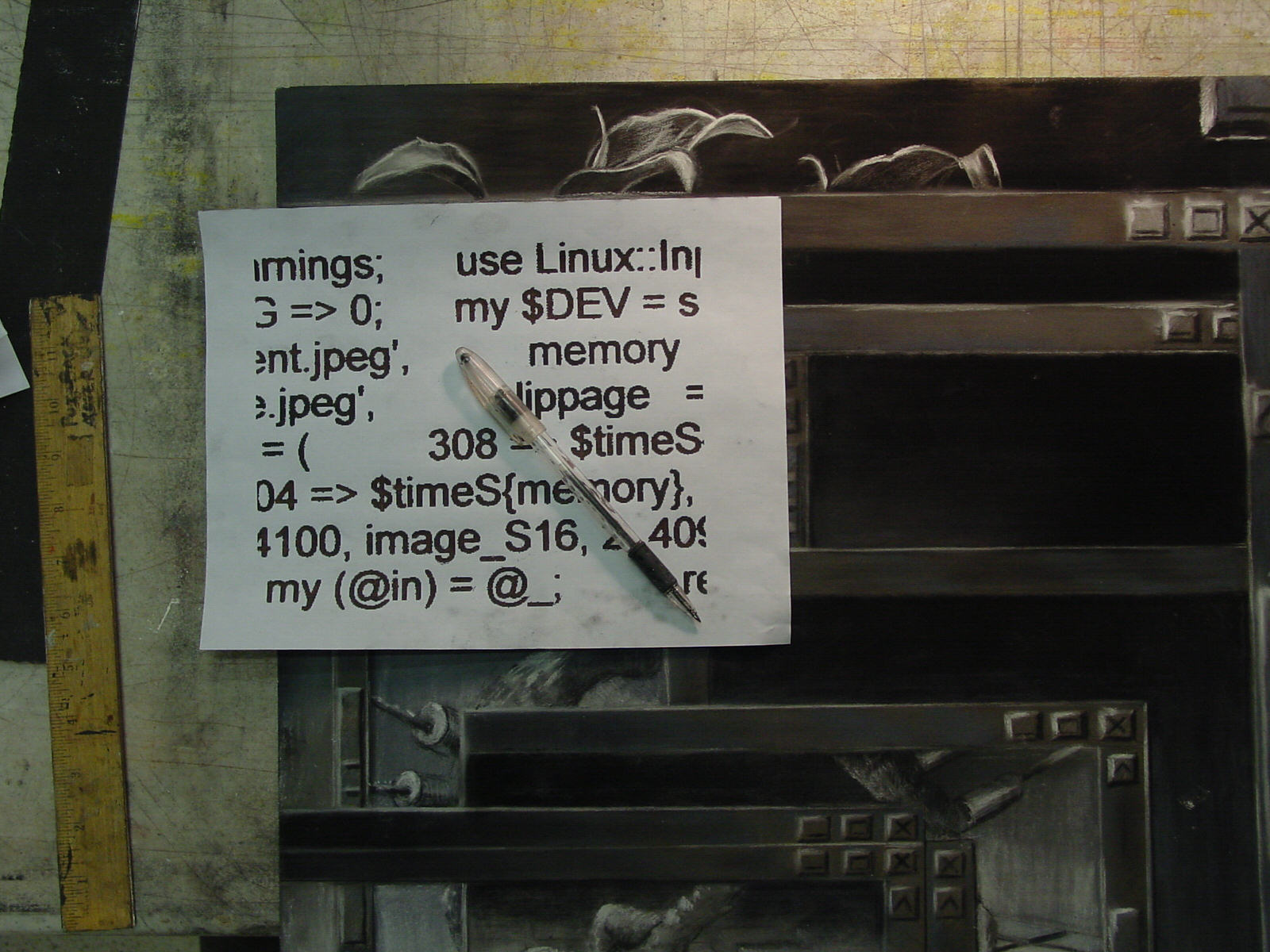
Third layer. Printed out bits of my Perl program (CTRL + PRTSC) graphically enhanced, (Print Mask for GIMPs). Pastel on back of print, then traced with ball point.

2009.11.23
Most my artwork of the last 10 years falls into this genre so it was no problem coming up with an idea for a class sample drawing. I was looking forward to doing this assignment, completely prepared. At the very last minute, I mean the nanosecond before putting pastel to paper, I changed my mind, inspired by the paper size. I love drawing on Sennelier pastel card but the largest available size is 19 x 26″. I felt restricted by the small paper. It reminded me of the laptop I inherited which is a standard sized laptop but feels like being in a doll house compared to my big screen, wireless mansion of a desktop. Furthermore the laptop was already loaded with MS Vista: windows popping open, scroll bars, some sort of MS designers gone mad translucency thing that has to be seen to be believed, I mean, totally anathema to anyone who knows how to micromanage their computer experience. Ubuntu, BSD, Perl anyone?
Since 2001 I have grown ficus retusa bonsai over circuit boards, real plants grown over real pieces of circuit board, and made the ceramic containers for them. Right before I started the drawing, I attempted to email an image of my bonsai using the laptop. Who knows what happened. The image broke into multiple windows on the laptop screen, probably nervous pastel coated fingers on that itty bitty fingerpad and the whole mess looked like….well, a potential drawing. With the thought that it would be easier to create a program for sending images than using someone else’s idea of an image sending program, I added a bit of my own Perl code, a program that admittedly I never got to work correctly, digitally speaking, but has its uses as a decorative element. The best laid plans and all that.
2009.11.22

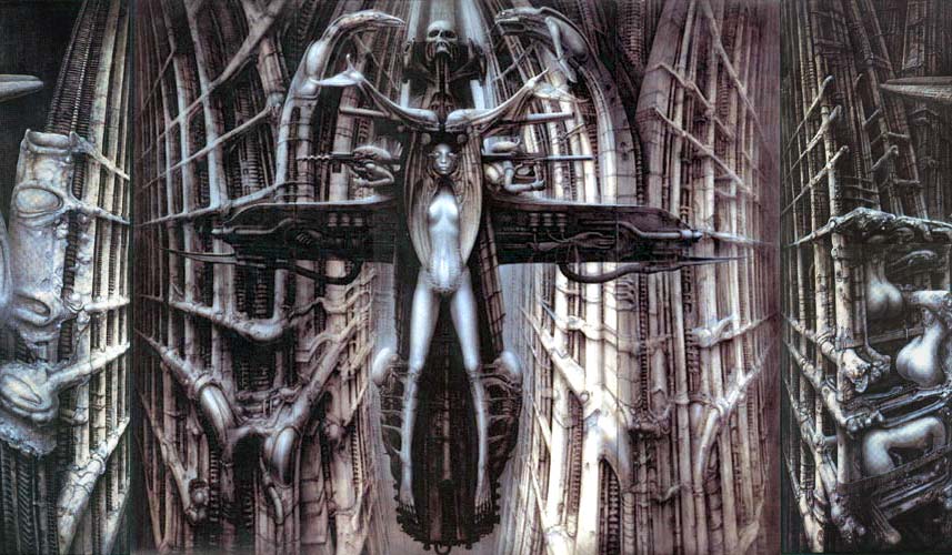
Websites: http://www.hrgiger.com/
http://boingboing.net/
Descriptive Words Biomech: surrealist, hyper representational, machine + human, machine + animal, dark, noir, pessimistic, technophobic, humans manipulated by tech, cyborg
Descriptive Words Geek: computer, tech, gadgets, repurposed, upcycled, human + tech, robots, tech as something controllable and fun, manipulated by humans
2009.11.21

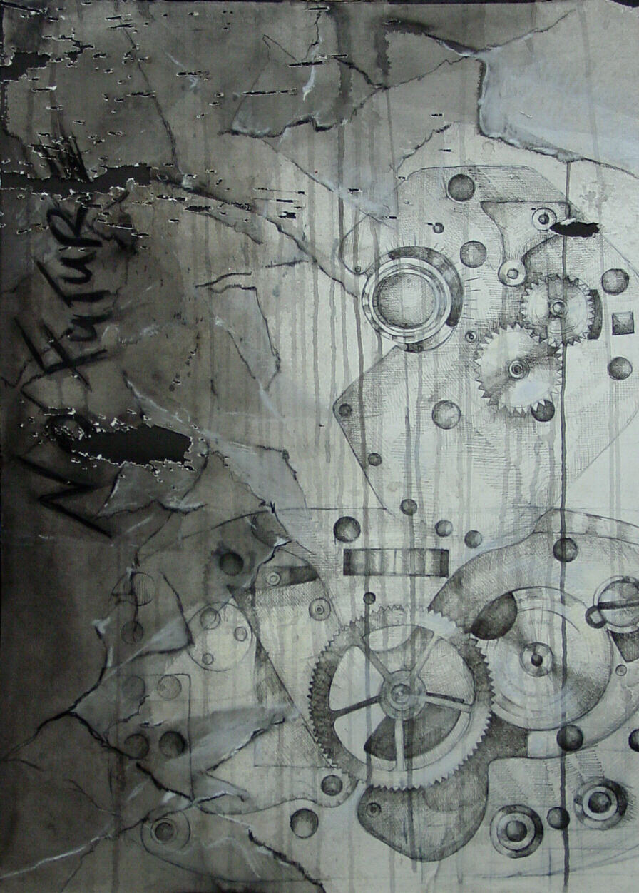
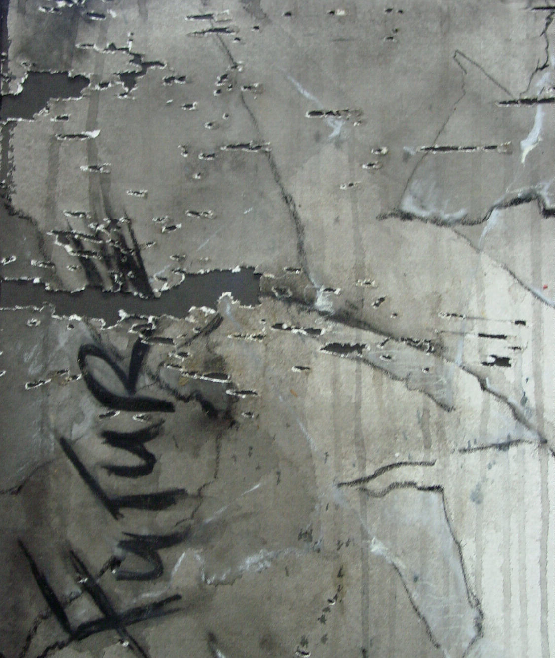
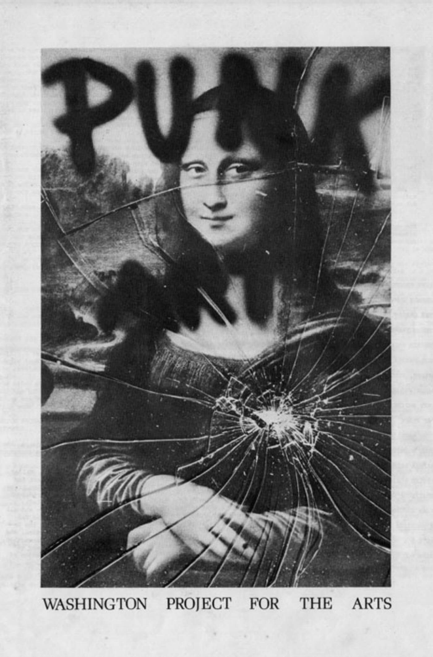
A wonderful thing about posting class samples on a blog is that as long as I take images throughout the process, I can ruin the actual but still have a sample posted. This allowed me to push the drawing really far, take some creative risks. To complete my Punk Genre drawing, I added the 70s punk slogan “No Future” in wet charcoal, furthering the concept initiated by the wrist watch parts though personally I’m a bit uncomfortable with text in drawings. Then I shot the drawing a couple times with a 20g shotgun when it was damp so paper would be punctured rather than shredded. I glued drawing onto heavy black paper for structural reasons. This flattened the texture created by shot somewhat but emphasized the punctures and stabilized the paper. Detail:

2009.11.07
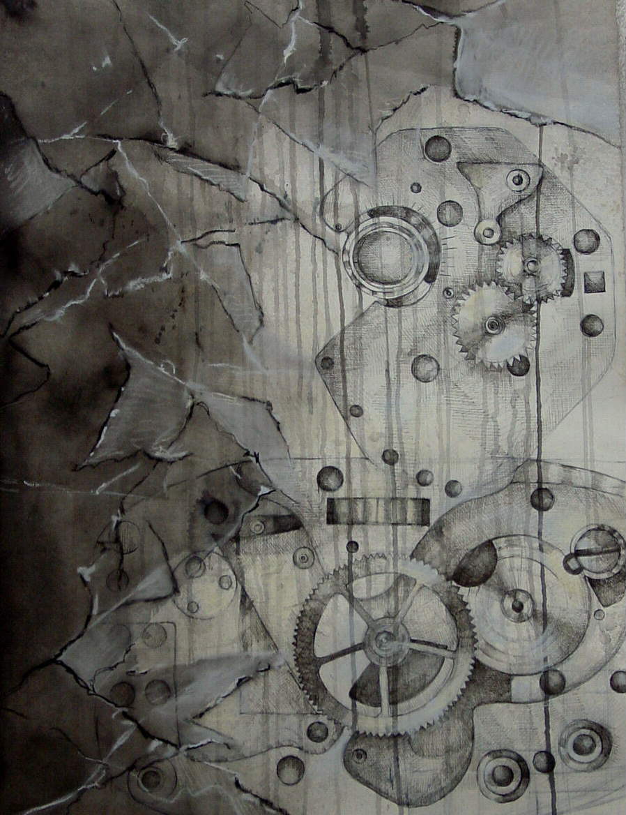
Final drawing meeting requirements for Week 2 Out of Class Drawing: Proportional Line with characteristics of Punk Genre(s).

Time: 1 to 2 hours a day for 4 or 5 days. Something like that. Paper: Rives BFK 34 x 26″ Media: black and white ink; black, gray and white pastel.
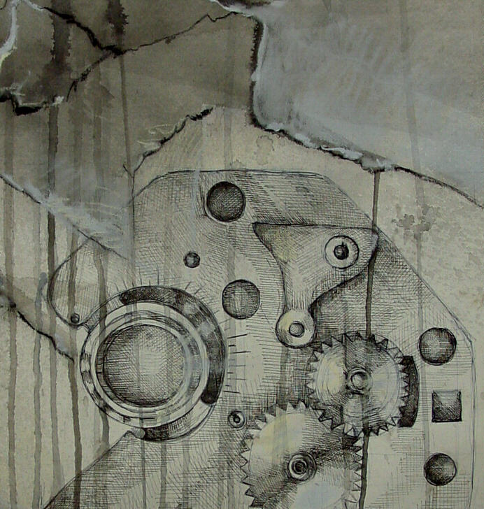
Admittedly a bit of overkill for a line drawing. Still, it is a build up of lines. Detail:

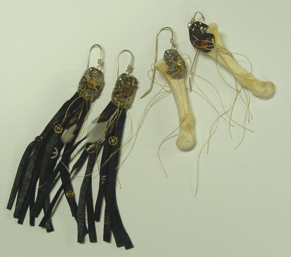
Actuals: Watch parts and a piece of broken glass. I found the broken glass in a dumpster. I had made the watch parts I had available into earrings prior to this project so ended up having to draw from the earrings:

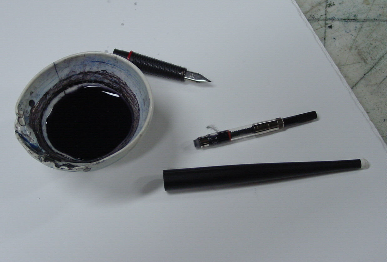
Process: Loaded Rotring fountain pen with ink + water for gray ink:

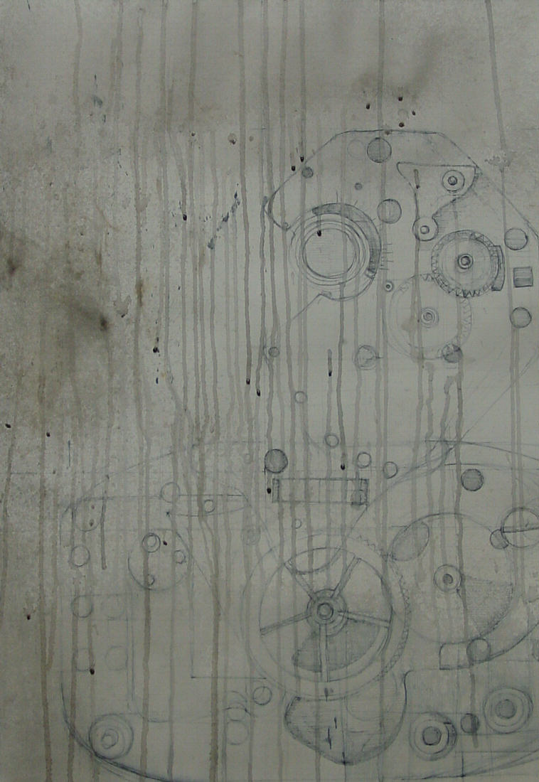
Worked on inking in proportional line drawing of watch parts in gray then spraying with water for runs and splatters. Admittedly, at this point, I was doing very unpunk things like swiping up runs with a kleenex when they threatened to mess up really good parts of the drawing.

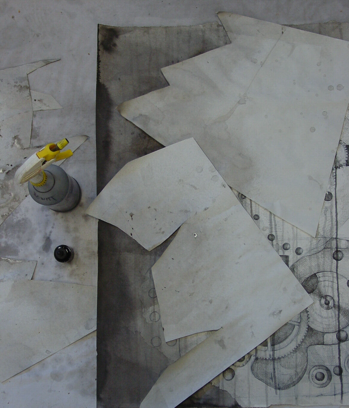
Inked in watch parts with black ink and used spray bottle to splatter gray ink over paper stencils resembling broken glass.

Finished with black, gray and white pastels. Used wet brush on pastels to define glass.
2009.11.07
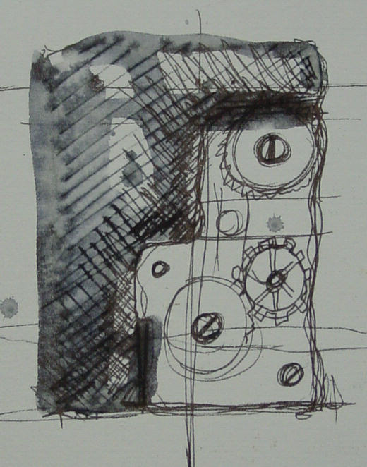
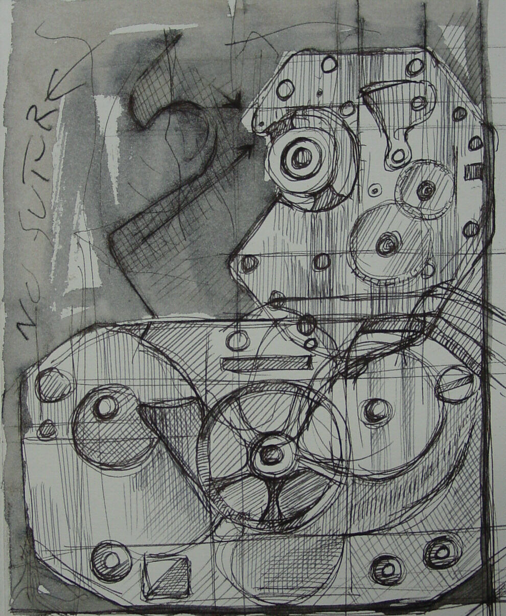
Two sketchbook drawings for the Week 2 assignment exploring Punk Genres. I was intrigued by the juxtaposition of the anti-aesthetics of 70s punks to the romantic aesthetics of Steampunk culture. This assignment was entirely inspired by a conversation I had with my Intermediate Drawing Class, or rather, it was me talking and they were politely listening as I went on and on about how edgy and grimy we, that is, the 70s punks were (I was there), as opposed to the aesthetically driven 00s punk genres. At some point I realized I had entirely lost my audience. When I asked if anyone knew what I was talking about, 2 students did that flat handed side to side airplane-coming-in-during-a rough-landing motion which could mean absolutely anything or absolutely nothing. And so, this assignment for the Advanced Drawing Class.


2009.11.02

Websites: http://98bowery.com/punkyears/index.php
http://www.morbidoutlook.com/fashion/articles/2009_07_steampunk.html
Descriptive Words 70s Punk: deliberate violation, monochrome, embraced what was considered ugly, anti-art, anti-aesthetic, disturb, disrupt, acidic, sarcastic, nihilistic, “no future”
Descriptive Words 00s Steampunk: fantasy, romance, neoVictorian, nostalgic, aesthetics, fashion, watch parts, more watch parts, then some more watch parts to the point where many Steampunk oriented sites open with the words, “Steampunk is not just about watch parts…”
|
